BRANDING
RECORD LABEL
Client: Key Producciones-
Logotype
- Illustration
- Animated video
- Album covers

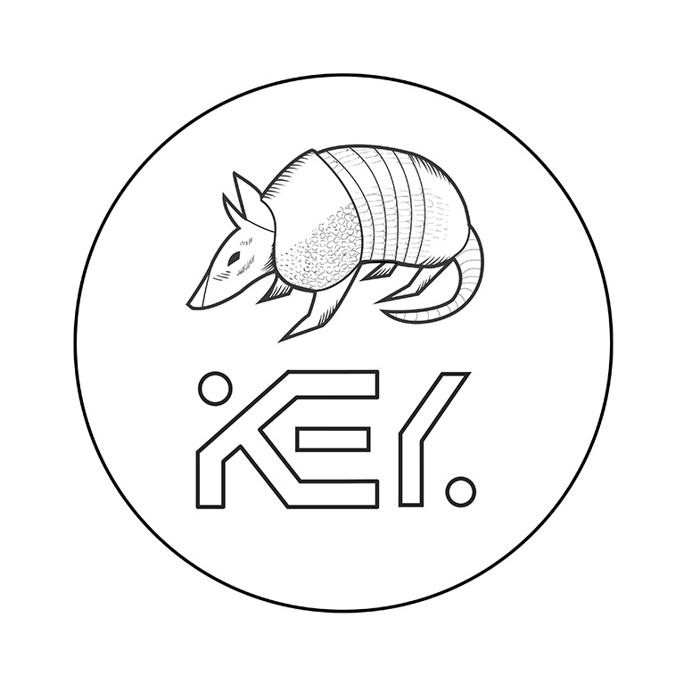
Loogtype Design
KEY Records is a record label founded by KEY Producciones, a live event production agency organizing large-scale music events.
With 15 years of expertise in orchestrating large-scale events, their venture into the digital music realm started in 2020. In pursuit of this new endeavor, they sought a distinctive logotype and the foundational branding that would underpin the label's diverse offerings.
Their vision for the logotype involved integrating the original KEY Producciones logo and introducing a distinctive figurative element.
CONCEPT
After extensive brainstorming with their creative team, an animal-themed motif took precedence, where we considered various creatures, from chameleons to foxes. What stood out the most to me, however, was the armadillo.

This resilient and compact, armored mammal is native to specific regions like Argentina and Uruguay. Given that the label owners hailed from these locations, I identified the armadillo as the perfect emblematic choice.
Video animation introducing the record label.
ALBUM COVERS
For the album covers, they were looking for surrealist-inspired compositions that would have a retro-futuristic feel to them, aiming to craft exclusive and distinctive artworks tailored to each album.

Album cover for KEY Records 01

Adaptation for Instagram Stories

Album cover for KEY Records 002

Album cover for KEY Records 005